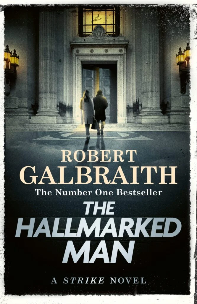
This week the cover for The Hallmarked Man, Robert Galbraith’s 8th book in the Cormoran Strike series, was revealed. And my word, is it gorgeous or what? It immediately made the top three of my favorites alongside Troubled Blood and The Ink Black Heart. We have no confirmation yet, but the book’s jacket is most likely created by Little, Brown’s Duncan Spilling, who also worked on the other Strike book covers.
I’m happy to share some thoughts on the wonders of this amazing cover. Because there is so much to say about the blurb that was also released this week, I’m intentionally leaving most of that out. It’s very much worthy of an entire blog of its own.
The Moment Before Entry
This is the first time we see Robin and Strike about to actually enter a building. So far, all covers show them outside in a deserted street, or in front of a building looking sideways. Now they are in motion, committed to going inside.
Grey Outside, Gold Inside
Everything outside is grey-toned and cold. There’s a warm glow coming from the lights that guide Robin and Strike to the open door. A similar golden light shines from behind the window. It could symbolise a coming truth, or emotional clarity that awaits them inside the building. Is this the start of ‘A Golden Journey’?
Cormoran Leads the Way
Another first is Cormoran being followed by Robin. He could be taking the lead due to the specifics of this investigation. The Freemasons are a brotherhood of men, and this could mean that Strike has easier access to a space where women are historically excluded. The way Strike is positioned also made me think it is a protective stance. He is slightly in front of her, but a bit to the side (yes, I’m over-analysing this 100%, and there’s a lot more of that to come). The subtle positioning still suggests that, professionally, they are entering as equals and partners, despite him leading the way.
You could also look at their positioning through an interpersonal lens. Cormoran is one step ahead of Robin when it comes to sharing his feelings for her, and is leading the way in that regard. An exciting thought from the ‘you’re clearly seeing what you want to see department’: strictly looking at the covers, Cormoran followed Robin for seven books. The roles are now reversed with her following him. Looking at where we were left at the end of The Running Grave, this is so meaningful. Perhaps she will follow his lead into truth and (emotional) intimacy.
Robin’s Burden
One of the first things that caught my eye when looking at this cover was Robin’s bag. I love me some handbags, and I instantly locked in on the large tote that Robin is carrying. While I can’t tell if it’s an actual handbag or a briefcase, if the bag is hers, both could symbolise her carrying weight, professional (I hope not too much after the draining work she did in TRG), or emotional. It could symbolise the weight of choices she made, unsaid feelings she carries around, a heavy loyalty she feels towards ‘Murphy-whats-not-to-like’, or difficult choices that still need to be made. She looks prepared, but weighed down. Chances are that the size of the bag isn’t just a coincidence.
Circles, Squares and Meaning
Both main characters are mid-step and about to cross a large symbol that’s visible on the floor. It’s a masonic war memorial, showing a large circle with a square inside. In Masonic symbolism, the square is actually the carpenter’s square, an L-shaped tool builders use to make sure everything’s perfectly straight. This is where the phrase ‘squaring your actions’ comes from. The circle stands for unity, eternity and spiritual truth. Together they show squaring the circle. It could symbolise a test of logic and emotion in Robin and Strike’s relationship, or a test of moral integrity in a case full of secrets.
The fact that this symbol is also a war memorial is an interesting link to Cormoran’s background in the army. I’m curious if that’s a coincidence. (Probably not).
Approaching the Light
Robin and Strike are walking towards an open door. The golden lights are on. It suggests they are invited, even though the door is only slightly ajar. While the welcoming lights inside could mean enlightenment, revelation and truth lie ahead, it could also be a potential danger. They could be heading for a fool’s gold (well, silver, but you know), or acting like moths heading towards a flame. Or are these golden lights in any way linked to the James Elroy Flecker header?
A Feminine Frame
And then there’s the silver font of the title. Jo has offered more than one hint about silver being important in this book: there was a bracelet, Sark, the island known for its silver, a silver neff, music (Silver Bells), and of course the title. But here’s where it gets interesting. The metal itself stands for the feminine, intuition and reflection. In contrast: think about the story we’re getting. There’s a man at the centre of the plot, we have a setting that centres around a brotherhood (the Freemasons), and a title focused on a man. A hallmarked man who I suspect is Strike himself, by the way.
From Troubled Blood, chapter 22:
Could the agency, for which they’d both sacrificed so much, which for Strike represented the culmination of all his ambitions, survive the partners falling into bed together? However he reframed this question, the answer always came back ‘no’, because he was certain, for reasons that had to do with past trauma, not from any particularly puritanical streak, that what Robin sought, ultimately, was the security and permanence of marriage. And he wasn’t the marrying kind. No matter the inconveniences, what he craved at the end of a working day was his private space, clean and ordered, organised exactly as he liked it, free of emotional storms, from guilt and recriminations, from demands to service Hallmark’s idea of romance, from a life where someone else’s happiness was his responsibility.
Yet, there’s a silver feminine that frames the heart of the story. Many of us eagerly wait to find out how Robin and Cormoran’s relationship proceeds in this book. Cormoran has made it clear how he feels (at least to us readers), and he was left in the dark with regards to how Robin felt. Everything hangs on her response. Will she reciprocate? Won’t she? When and how will she let him know? Whatever choice she makes will have major consequences for the final books. It seems as if The Hallmarked Man has an intentional, and amazing balance of male and female layers that are connected to silver!
Hear, See, Be Silent
Lastly, the header J.K. Rowling shared at the beginning of 2024 shows a central coat of arms or a heraldic shield of sorts, surrounded by the words: Audi, Vide, Tace. It appears above the entrance of the Freemasons lodge. The Latin words translates to ‘Hear, see, be silent’ and is a motto often used in Freemasonry.
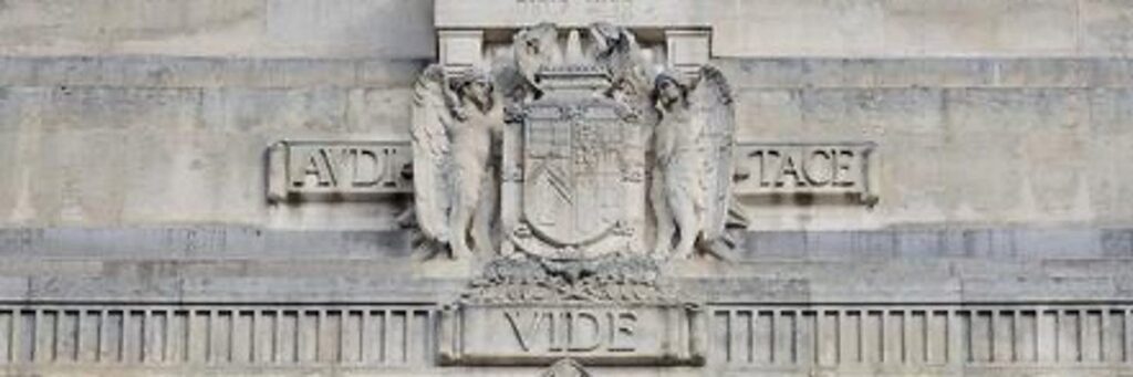
The complete phrase is ‘Audi, vide, tace, si vis vivere in pace’ and translates to ‘Hear, see, be silent, if you would live in peace’. The ‘si vis vivere in pace’ is missing from the building and the cover, but the full phrase feels like a fitting mirror for the relationship journey Robin and Strike are on.
Audi: hear. Robin heard Strike’s confession of love…right?
Vide: see. They see each other for who they are…right?
Tace: be silent. From what we learned from the blurb, Robin may choose not to speak about his confession, or her feelings, yet. But if you want to live in peace…speaking out might just be an absolute necessity. You’re welcome for the unsolicited life advice.
Reflections
Collectively, all the elements offer a final interesting idea: the positioning of the main characters, the smooth polished floor, the twinning beacons of light, the silver font, even the two pillars next to the entrance: they all evoke mirroring. I hope Robin and Strike are about to face reflections of themselves (and each other) between the covers of this book, and that we’ll gain more insight into who they are, what drives them, and why they make the choices they do. I can’t wait to dive into this book and find out more!
Thank you for a fun read! Such a pretty cover. I especially like the light coming out of the building. So close now!
The color they chose for that light is fabulous! It might be on the other side of the color wheel from grey, but it works perfectly.
Really well said, Iris. Loved it, thanks so much for your efforts. Thanks TSEF for moving this forward for our enjoyment.
Thanks for reading! It’s lovely to be able to scribble a bit and enjoy the ride to publishing day with other book lovers 🙂
Such a fun read! Thank you, Iris… when I read the book summary that accompanied the release of the cover I was a bit crushed as it suggests that Strike’s admission of his feelings does not, in fact, deter Robin from Murphy. I am hoping that changes in the course of this book, and I’m choosing to interpret Iris’ analysis of the cover as supporting that hope!!
Me too.
Love deciphering an image, so much to chew on here, thx!
I’d add one thing that strikes me here – the architectural framing is very strong (massive columns, flanking lanterns, grand ceremonial doors to an inner sanctum, etc.) All creating a sense of gravitas & a suggestion that this case involves going up against a powerful institution, with all the authority & fortress-like defenses that implies.
About their relative positioning – there was a discussion somewhere about that a while back and I happened to ask my daughter for her take, looking at past covers. (For context, she’s a sr. designer for one of the “Big Five” publishers & an experienced illustrator – has done several mystery/thrillers, including US covers for another big UK mystery/thriller writer.) She hasn’t read the Strike series, so her response was just an off-the-cuff response, purely as a designer…and interestingly, what struck her wasn’t really who was literally following/leading. Rather, it was that Strike walking ‘behind’ Robin actually puts him in the foreground for someone viewing the cover – larger in scale & the more prominent/dominant or focal figure to the reader in a visual sense. (Here, of course it’s the inverse on THM.) Anyway, just an alternate perception to ponder.
I should add, that this hierarchy of relative size/prominence of the figures is maybe more pronounced in earlier cover than THM, where there seems to be more distance between Robin & Strike.
I see what you mean and that’s a great insight! We’ve had two covers, or three (the oldies) where Strike was alone on the cover. The new Duncan covers all have Corm as the focal point, which makes sense with him being the MC. I love the idea idea that Robin’s story may get some extra weight in this book! Thanks for sharing!
Does it look like Robin has one leg and Strike two. Even the shadows. Hmmm
YES! I can’t see Robin’s right leg!
YES! I can’t see Robin’s right leg!